Seattle front door paint colors for quick curb appeal
A front door can make a Seattle home look cared for—or make an otherwise solid listing feel unfinished before a buyer reaches the entry. The decision is not simply whether to choose black, navy, green, or natural wood.
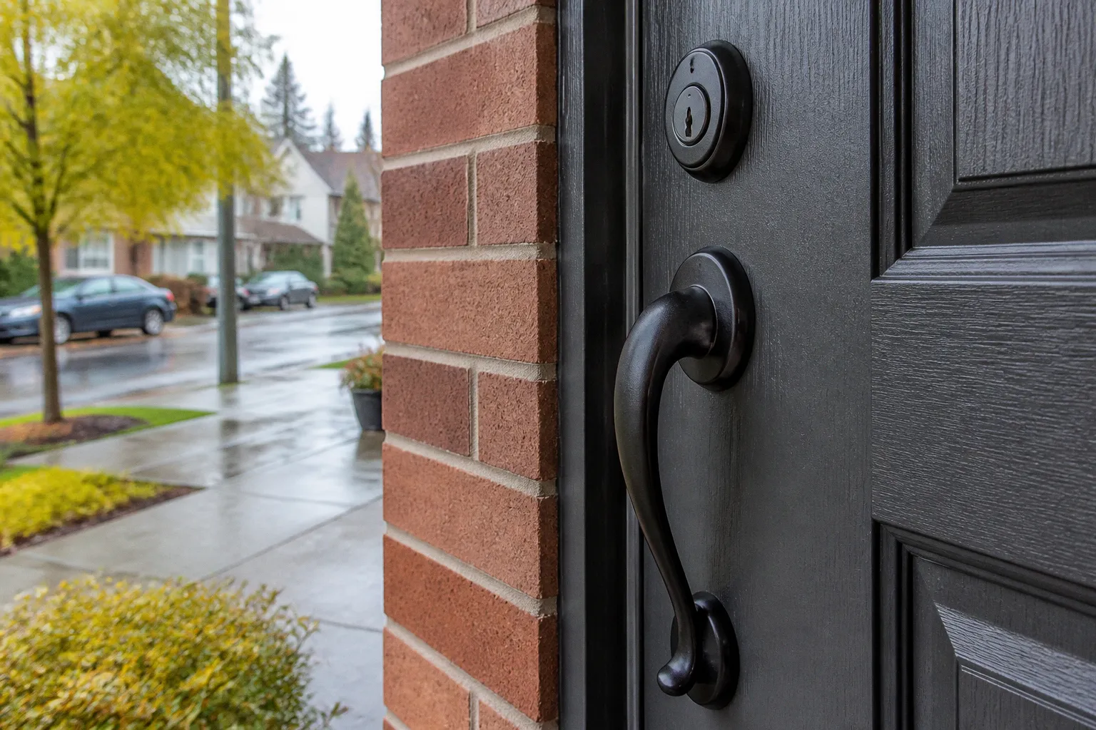
The real question is how much contrast the door needs, whether the color works with the home’s siding or brick, and whether the finish supports the architecture instead of competing with it.
That distinction matters in a market where buyers often make a fast first impression from listing photos. Seattle’s gray skies, evergreen landscaping, cedar details, painted siding, and Craftsman-era architecture create a specific backdrop. A color that looks energetic in a sunny catalog can read flat, cold, or mismatched under Pacific Northwest light.
The most effective Seattle front door paint colors for curb appeal are usually not the loudest ones. They are the colors that give the entry a clear visual anchor, complement the exterior materials, and create enough contrast to be noticed without turning the front elevation into a design experiment.
The financial impact of front door color on Seattle resale
Painting a front door is one of the least expensive visible improvements a homeowner can make before listing. It does not require a contractor, a permit, or a multi-week renovation schedule. With basic preparation and quality exterior paint, the project can often be completed over a weekend. That makes it attractive as a quick curb appeal front door paint upgrade.
But low cost does not mean low consequence. Color affects how buyers interpret the home’s maintenance level, personality, and finish quality. A freshly painted door with coordinated hardware can suggest that the rest of the property has been managed carefully. A peeling, faded, or poorly matched door signals deferred maintenance before the buyer has seen the kitchen.
Zillow’s 2026 Paint Color Analysis found that front door color can influence buyer response and estimated sale price, although the results depend heavily on the home’s exterior and the relationship between the door and the surrounding facade. In the study:
- A black front door was associated with an average estimated price premium of $6,449.
- A light blue door on a simple white home was associated with a potential $5,023 premium.
- A charcoal gray door on a dark red brick home was associated with a $3,753 premium.
- A pale pink door was associated with an estimated $6,516 decrease.
- A cement gray door was associated with an estimated $3,365 decrease.
- A red door on a light brick home could reduce what buyers were willing to offer by as much as $6,738 because of clashing undertones.
Those figures are not a promise that painting every Seattle door black will add $6,449 to the sale price. They are national study results, not a Seattle-specific appraisal model, and the actual outcome depends on architectural style, neighborhood expectations, condition, photography, and the rest of the exterior palette.
The useful takeaway is more practical: color has a cost-to-value ratio because the material cost is modest, while the visual impact is concentrated in one of the most photographed parts of the home.
A front door color should earn its place twice: first in the listing photos, and then in the buyer’s in-person walk-up.
What the project should cost
For a standard wood or fiberglass door, a DIY repaint generally requires:
- Exterior-rated primer, if the existing surface is bare, glossy, stained, or dramatically changing color.
- One quart of quality exterior paint or urethane-modified trim paint.
- Sandpaper, filler, painter’s tape, drop cloths, and cleaning supplies.
- New screws or touch-up supplies for the hardware if the existing set is corroded.
The paint itself is rarely the expensive part. Labor becomes the major cost when the door must be stripped, repaired, removed, or refinished. A door with peeling layers, water damage, failed glazing, or a complicated stained-wood finish may be a restoration project rather than a simple color refresh.
For pre-sale work, I would not spend heavily on a door that is structurally sound but visually tired. I would spend on surface preparation, a durable finish, and hardware that photographs cleanly. That is where the sweat equity pays back.
Choose contrast before you choose a color
Many homeowners begin with a paint chip. I begin with the exterior.
The door should be evaluated against:
- The siding color and undertone.
- Brick, stone, or concrete around the entry.
- The trim color.
- The roof and foundation tones.
- Existing landscaping, especially dark evergreen planting.
- The amount of natural light at the entry.
- The home’s architectural style.
Seattle homes often have a layered exterior: painted lap siding, cedar shingles, dark roofing, mossy landscaping, and white or cream trim. The door has to hold its own within that composition. If the siding is medium gray and the trim is white, a charcoal or navy door can create a controlled focal point. If the home is already dark, a lighter muted blue or warm white may provide better separation.
The biggest mistake is treating contrast as a synonym for brightness. A door does not need to be vivid yellow or saturated red to stand out. Contrast can come from value—the lightness or darkness of a color—as well as temperature and finish.
For example:
- A deep navy door against warm white siding has strong value contrast.
- A sage green door against cedar shingles has softer contrast but strong material harmony.
- A charcoal door against red brick creates contrast without adding a new bright hue.
- A natural wood door against painted siding creates warmth and texture rather than a high-impact color block.
A good pre-sale door color usually performs one of three jobs: it clarifies the entry, balances the facade, or adds warmth to a cool exterior.
The PNW palette: colors that work with Seattle light
Pacific Northwest front door ideas tend to work best when they acknowledge the landscape rather than fight it. Evergreen foliage, wet pavement, cedar, stone, and overcast skies create a naturally subdued environment. Earthy greens, deep blue, warm whites, and dark neutrals have enough complexity to remain attractive in changing light.
Sage and olive green
Sage is one of the most forgiving choices for Seattle curb appeal. It works with cedar, cream trim, gray siding, and mature planting. The best versions are muted rather than neon—colors with enough gray or olive undertone to feel architectural.
Sage is especially effective on:
- Craftsman bungalows with natural wood details.
- Homes with stone or brick porch elements.
- Light gray or warm white siding.
- Properties with established shrubs and ferns.
Olive green creates a deeper, more grounded effect. It can make a small entry feel intentional without the visual weight of black. On a home with dark roofing and medium-tone siding, olive may provide enough contrast while preserving a Northwest character.
The risk is undertone. A green that leans too yellow can look dated against cool gray siding. A green that leans too blue may lose its earthy quality in cloudy light. Test the sample on the actual door and view it in the morning, afternoon, and evening.
Deep navy blue
Navy is a strong choice when the homeowner wants a classic front door with more personality than black. It coordinates with white, cream, gray, and many red-brick exteriors. In Seattle, deep blue also photographs well under overcast conditions because it retains color without appearing washed out.
Use navy when:
- The trim is white or warm white.
- The exterior has cool gray or blue-gray siding.
- The home needs a defined entry but black would feel too severe.
- Brass or bronze hardware will add warmth.
Avoid selecting a navy that is so dark it reads as black in listing photos. That is not necessarily a problem, but it removes some of the color distinction. A sample board placed outside will show whether the blue remains visible in shade.
Warm white
Warm white can be elegant on a dark or colorful exterior, but it is not automatically a safe choice. A white door on a white house performed poorly in Zillow’s study of monochromatic homes, ranking last for buyer interest and tour intentions. When the door, siding, and trim all have nearly the same value, the entry can disappear.
Warm white works better when it is used intentionally against:
- Dark charcoal siding.
- Deep green exteriors.
- Red or brown brick.
- Natural wood siding with dark trim.
- A facade where the door needs to brighten a shaded porch.
The key is separation. If the door is warm white, the surrounding trim or siding should provide enough contrast to frame it.
Charcoal and dark neutrals
Charcoal is a practical middle ground between black and medium gray. It can look tailored on contemporary homes, Tudor-influenced properties, brick exteriors, and updated Craftsman houses. Benjamin Moore’s 2026 trend color Silhouette, a charcoal with chocolate-red undertones, reflects the broader move toward warmer dark neutrals.
Dark neutrals are useful when the exterior already contains several materials. They simplify the entry rather than adding another competing color. They also pair well with:
- Unlacquered brass.
- Champagne bronze.
- Aged bronze.
- Matte black hardware.
- Warm cedar accents.
Cement gray is a different proposition. On a pale or cool facade, it may blend into the background and create a flat, unfinished effect. Zillow’s analysis associated cement gray with a negative price impact, which supports what I often see in staging: a gray door needs either strong contrast or a warmer surrounding palette to avoid looking institutional.
Avoid the monochromatic trap
A coordinated exterior is not the same as a monotone exterior.
Matching the front door to the siding can look polished when the materials and values are carefully controlled. But when the door disappears into the facade, curb appeal suffers. This is particularly common with white homes: white siding, white trim, white door, and cool gray hardware create no clear stopping point for the eye.
A front door should be legible from the sidewalk and in a thumbnail-sized listing photo. That does not mean it needs to dominate. It means the entry should have a visible center.
A simple contrast test
Photograph the front elevation from the street, then reduce the image to a small size on your phone. If you cannot immediately identify the door, the color may be too close to the siding or trim.
You can also convert the photo to black and white. If the door and surrounding wall become the same gray value, the color relationship lacks structural contrast. A muted green may still be beautiful in person, but if it disappears in photography, it is a weak pre-sale choice.
The strongest color depends on the complexity of the exterior. Zillow’s findings show that a neutral charcoal door can perform well against dark red brick, while a light blue door can work effectively on a simple white home. In other words, the same door color does not create the same result on every property.
Use the entry as a controlled focal point
If the house already has visual complexity—mixed siding, stone, brick, decorative gables, and large planting beds—the door should probably be simpler. A dark neutral or natural wood finish can organize the facade.
If the house is visually plain, a more distinct color may add useful character. A deep navy, restrained blue, or earthy green can make a basic elevation feel more considered without requiring a full exterior repaint.
For most Seattle listings, I would rank the visual priorities this way:
1. Make the door visibly separate from the siding.
2. Match the color temperature to the exterior materials.
3. Preserve the home’s architectural character.
4. Choose a finish that looks clean in both shade and direct light.
5. Add hardware that supports the color instead of creating a competing focal point.
2026 colors and hardware pairings
Current front door trends are moving toward colors with depth rather than high saturation. That is a useful direction for Seattle because complex tones tend to hold up better in soft, indirect light.
Three 2026 color references are particularly relevant:
- Universal Khaki by Sherwin-Williams, SW 6150: a warm neutral that can work with cream, stone, brown, and muted green exteriors.
- Hidden Gem by Behr, N430-6A: a deep teal that introduces color while staying connected to the blue-green landscape.
- Silhouette by Benjamin Moore: a charcoal with chocolate-red undertones that brings warmth to a dark neutral.
These are not mandatory shopping instructions. They are useful starting points for understanding the current palette. The best selection still depends on the existing exterior. Universal Khaki may look refined against dark siding but muddy beside yellow-beige brick. Hidden Gem may be excellent with cedar and cream trim but too busy on a facade that already has blue-gray siding.
Hardware is part of the color decision
A newly painted door with old, pitted hardware will not deliver a finished result. The fixture allowance should be planned alongside the paint, not after it.
In 2026, warmer metal finishes are replacing the cold chrome and stainless-steel look in many residential entries. The most useful options for Seattle homes include:
| Door color or finish | Hardware pairing | Why it works |
|---|---|---|
| Deep navy | Aged brass or champagne bronze | Adds warmth and keeps the entry from feeling cold |
| Sage or olive | Matte black or dark bronze | Reinforces the earthy, grounded palette |
| Charcoal | Unlacquered brass or bronze | Creates controlled contrast against the dark surface |
| Warm white | Matte black or aged brass | Gives the light door a defined outline |
| Natural stained wood | Aged bronze or simple black | Preserves the material-focused character |
| Deep teal | Bronze or subdued brass | Keeps the color sophisticated rather than playful |
Do not replace functioning hardware solely because a trend report says a finish is current. Replace it when the existing set is visibly worn, mismatched, or difficult to photograph. A clean, coordinated set has more value than an expensive designer lever installed on a door with poor preparation.
When natural wood is the better decision
Not every Seattle front door should be painted.
Craftsman homes are common throughout the region, and many have architectural details that depend on natural materials: cedar shingles, exposed rafters, tapered columns, and wood porch elements. A stained wood door can reinforce that character more effectively than a painted accent color.
Choose natural wood when:
- The door has attractive grain and no significant veneer damage.
- The home includes cedar siding or substantial wood trim.
- The architecture is Craftsman, bungalow, or historically influenced.
- The entry receives enough protection from rain to maintain the finish.
- The existing stain can be refreshed without stripping the entire door.
Natural wood is not maintenance-free. A faded or blotchy door is not automatically better than a painted one simply because it is original. If the finish has failed, the door may need cleaning, sanding, conditioning, stain, and exterior topcoat. That can take more time than repainting.
For a listing on a tight schedule, assess the door honestly. If the grain is good and the finish can be restored cleanly, save the wood. If the door is damaged, patched, or visually inconsistent with the rest of the property, paint may deliver a more reliable finish.
A painted wood door also gives you flexibility. A warm black, charcoal, deep navy, or olive can preserve the weight of the entry while hiding minor surface variation. That is often the better cost-to-value ratio when the door is serviceable but no longer attractive.
Natural wood is an architectural asset only when it looks maintained. Originality does not excuse a failed finish.
A practical weekend process
The quality of the result depends more on preparation than on the color name. Even the best PNW front door paint idea will look inexpensive if it is applied over dirt, peeling paint, or glossy patches.
1. Inspect before you shop
Look for:
- Cracked or loose paint.
- Soft wood at the bottom rail.
- Failed caulk around trim or glass.
- Rust around hinges and latch hardware.
- Water staining or swelling.
- Uneven previous repairs.
If the door is swollen, dragging, or soft at the threshold, pause the paint project. The visible problem may be moisture intrusion or a larger installation issue.
2. Clean the surface thoroughly
Seattle entries collect pollen, dust, road film, and moisture-related residue. Wash the door with a suitable cleaner, rinse as needed, and allow it to dry fully. Do not sand a dirty surface; you will grind contamination into the finish.
3. Sand for adhesion, not demolition
The goal is a stable, smooth surface. Remove loose paint and knock down glossy areas. You do not need to strip every layer if the existing coating is sound. Fill dents and nail holes, then sand the repair flush.
4. Prime strategically
Use primer on bare wood, repaired areas, glossy coatings, and strong color changes. A quality bonding primer is especially useful when moving from a slick factory finish to a new paint system.
5. Paint the edges and panels carefully
Remove the hardware when possible. If the door must remain hung, protect the hinges and threshold. Work from the recessed panels and profiles toward the broader faces, maintaining a wet edge. Thin, even coats are more durable and cleaner than one heavy coat.
Follow the recoat window on the product label. Seattle’s humidity and cool temperatures can extend drying time, particularly on a shaded porch. A door that feels dry to the touch may not be cured enough for repeated use.
6. Reinstall or refresh hardware
Clean existing hardware, replace visibly damaged pieces, and make sure the latch operates smoothly. The entry should feel as finished as it looks.
7. Photograph the result
Take a street-level photo in the same general conditions used for listing photography. If the door looks too dark, too flat, or too close to the trim, make the adjustment before the photographer arrives.
Color decisions by exterior type
The following combinations are a useful starting point for Seattle home staging, but they should still be tested against the real facade.
| Existing exterior | Strong door directions | Use caution with |
|---|---|---|
| White siding with white trim | Navy, charcoal, deep teal, muted blue | White-on-white, pale gray |
| Warm white or cream siding | Olive, black, deep navy, natural wood | Icy blue, cool cement gray |
| Gray siding | Navy, black, sage, warm white | Blue-gray that disappears into the siding |
| Red or dark brick | Charcoal, black, warm wood, muted green | Bright red with competing undertones |
| Cedar shingles | Natural stain, olive, deep navy, dark bronze | High-saturation primary colors |
| Dark exterior | Warm white, muted blue, medium sage, natural wood | Black unless the trim clearly frames it |
| Craftsman bungalow | Stained wood, olive, navy, charcoal | Trend-driven colors unrelated to the architecture |
| Contemporary home | Charcoal, black, deep teal, restrained warm neutral | Fussy contrast that conflicts with clean lines |
A red door deserves particular caution. It can be attractive on the right property, but it is not universally positive for resale. Against light brick, a red with the wrong undertone can clash strongly and reduce buyer appeal. If the exterior already contains warm red, orange, or terracotta notes, test the door color in context rather than relying on a small paint card.
Bright yellow and orange also require a real-site test. Their performance under Seattle’s overcast winter light is less predictable than that of deep neutrals and earthy tones. They may work beautifully on a simple facade, but they are not the first colors I would recommend for a seller seeking a broad buyer response.
Spend versus save: the pre-sale verdict
Spend on: surface preparation, exterior-rated paint, primer where needed, and a clean, coordinated hardware set. These improvements are visible, relatively contained, and directly tied to the entry’s presentation.
Save on: unnecessary door replacement, elaborate custom hardware, multiple decorative accessories, and a full exterior repaint when the rest of the facade is in sound condition.
For most Seattle properties, the best front door colors are deep navy, charcoal, muted sage or olive, a carefully selected warm white, or a restored natural wood finish. The right choice is the one that creates clear contrast, respects the architecture, and looks composed in the flat light that defines much of the local selling season.
My definitive spend-versus-save recommendation is straightforward: spend on preparation and contrast; save on novelty. A front door does not need to be the most memorable surface on the block. It needs to make the home look maintained, welcoming, and correctly priced before the buyer steps inside.