Seattle Craftsman exterior paint: A color scheme plan
The most expensive paint mistake on a Seattle Craftsman usually happens before anyone opens a can.
A buyer or seller chooses a color from a tiny paper chip, falls for a trendy gray, and only notices the problem after the siding, trim, and porch have turned into one flat block of gloom.
That is not a color strategy. That is a closing-table surprise with a paintbrush attached.
Seattle Craftsman exterior paint colors have to do several jobs at once: respect the architecture, hold their own under gray skies, survive persistent moisture, and improve the property’s curb appeal without making it look like a themed renovation. The house should feel considered, not costume-ready. You need a scheme that separates the body, trim, foundation, porch, and front door while keeping the whole elevation under control.
The winning approach is simple: start with the structure, choose colors for Seattle’s actual light, then assign every color a job.
The Pacific Northwest Palette: Balance Gray Skies and Historic Charm
Seattle’s light is not a neutral backdrop. It is soft, cool, and changeable, with long stretches of cloud cover and damp surfaces that deepen shadows. A color that looks crisp and cheerful in a bright showroom can look blue, muddy, or nearly black on a north-facing Craftsman.
That does not mean every Seattle house needs to be painted beige. It means you cannot ignore the climate while pretending color exists in a vacuum.
The strongest exterior paint schemes for Pacific Northwest homes usually draw from a restrained natural palette:
- muted olive and sage greens that connect the house to mature landscaping;
- warm grays with brown or taupe undertones;
- deep blue-greens that work with cedar, stone, and dark roofs;
- softened creams and putty tones for trim;
- clay, rust, or muted red accents used sparingly;
- charcoal, espresso, or nearly black colors for doors and selected details.
The phrase “natural palette” gets abused in real estate marketing, usually because someone wants to sell you another shade of greige. That is not the point. A natural palette has depth and relates to the materials around the house. It should work with cedar shingles, brick piers, concrete steps, basalt retaining walls, mossy planting beds, and the dark rooflines common across Seattle neighborhoods.
A Craftsman in Ballard may need a different balance than one in Mount Baker or Columbia City. The surrounding streetscape matters. So does the lot. A heavily shaded house with large evergreen trees can handle more warmth than a compact home surrounded by bright pavement and neighboring facades. A house near the water may benefit from a cleaner, less yellowed scheme, while a property enclosed by greenery can support deeper greens and earthy browns.
Assign each color a function
Do not begin by asking, “What color should the house be?” Begin with four more useful questions:
1. What is the main body color?
2. Which architectural elements should receive emphasis?
3. What needs to visually recede?
4. Where can a stronger accent earn its place?
A typical Seattle Craftsman scheme has at least three working layers:
| Exterior element | Color strategy | Why it works |
|---|---|---|
| Main siding or stucco | Mid-tone, slightly muted color | Gives the house presence without making the facade look heavy |
| Trim, columns, and window surrounds | Lighter or warmer contrasting color | Defines the architecture and keeps details visible under overcast light |
| Front door and selected accents | Dark, saturated, or warmer contrast | Creates a focal point without repainting the entire house in a loud color |
| Foundation and lower wall areas | Deeper, dirt-tolerant neutral | Grounds the home and disguises splashback from wet weather |
| Porch floor and steps | Durable, low-maintenance tone | Handles traffic and moisture without competing with the facade |
The table is not a formula. It is a chain of command. The body controls the mass of the house. The trim explains the architecture. The door tells visitors where to go.
Your front door is an accent, not a cry for help. Use contrast to direct attention, not to make the house visible from the freeway.
Authentic Color Theory for Seattle Craftsman Architecture
Historic Craftsman homes were designed around material and proportion. Wide eaves, tapered columns, exposed rafter tails, porch roofs, grouped windows, and a low-slung relationship to the site all create visual weight. Paint should clarify those elements rather than flattening them.
The common failure is an all-one-color exterior. It may look clean in a listing photo, but it erases the very details that make a Craftsman desirable. Another failure is the opposite: too many colors, each one assigned to every available board, bracket, and window sash. That turns architectural distinction into visual noise.
Aim for hierarchy.
Start with the body color
The body is the largest painted surface, so it determines how large and heavy the house feels. In Seattle, medium-depth colors are often more forgiving than very pale or very dark choices.
A pale body can make a shaded home look washed out, especially when paired with stark white trim. A very dark body can look handsome on a simple elevation but oppressive when the house has dense vegetation, narrow setbacks, or limited natural light.
Useful body-color families include:
- gray-green with a low-key, earthy character;
- warm stone or mushroom gray;
- muted blue-gray, provided it does not turn icy in shade;
- subdued olive or lichen green;
- softened taupe that supports wood and masonry details.
Do not judge the body color by the front elevation alone. Look at the side wall, the porch recess, and the portions of siding beneath the eaves. Those areas reveal how the color behaves when light disappears.
Use trim to explain, not outline
Craftsman trim is substantial. It is not the thin white border found on many newer builder homes. Wide fascia, porch columns, window casings, and knee braces can carry a warmer off-white, cream, putty, or light taupe.
Pure white is not automatically wrong, but it is often too sharp against the softer colors and natural materials associated with Seattle Craftsman architecture. If the body is a cool blue-gray, a warm white trim may create an intentional tension. If the body is olive or brown, a creamy trim can keep the elevation from becoming dull.
The trim should make the house legible from the sidewalk. That does not mean every board needs the highest possible contrast. It means the key shapes—porch columns, window groups, gable details, and entry surround—should remain visible.
If the house has replacement windows, be especially careful. Bright white vinyl frames can become the most noticeable trim element whether you planned for it or not. Choose the surrounding paint to work with the existing window material instead of pretending the windows are still original wood.
Treat the front door as a controlled risk
The front door is where you can introduce more personality. Deep teal, oxblood, burnt orange, dark red, or nearly black can all work, depending on the body and trim. The porch ceiling, lighting, hardware, and planting should support the choice.
A saturated door color looks intentional when the rest of the exterior is disciplined. It looks desperate when the body, trim, shutters, railings, and flower boxes are all competing for attention.
If the entry is recessed, a darker door can create welcome and depth. If the entry is already shadowed, a very dark door may disappear. In that case, use contrast around the frame, better lighting, or a warmer accent rather than simply choosing the darkest available paint.
Weather-Resistant Finishes for High-Humidity Environments
Color selection gets the attention. Surface preparation determines whether the job survives Seattle’s wet seasons.
Paint cannot solve rotten wood, trapped moisture, failing caulk, or a gutter that dumps water onto the siding. If the substrate is unstable, the new color is just expensive camouflage. The finish may look good at the listing appointment and fail during the first serious cycle of rain and drying.
Before choosing sheen or color, walk the exterior with a sharp eye. Look under eaves, around window sills, at the bottom edges of siding, beside downspouts, and where porch roofs meet the main wall. These are the places where water-related problems stop being theoretical.
The preparation sequence matters
A reliable exterior repaint generally involves:
1. Cleaning the surface. Remove dirt, chalking residue, algae, and biological growth. Seattle’s damp conditions give grime plenty of opportunity to establish itself.
2. Allowing the substrate to dry. Painting over damp wood or masonry traps trouble beneath the finish.
3. Scraping only what is loose. Do not turn every old layer into a demolition project without a reason. Remove failing material and feather the edges.
4. Repairing damaged areas. Replace or stabilize rotten trim, split boards, failed siding, and deteriorated porch components.
5. Re-caulking vulnerable joints. Focus on penetrations and transitions where water can enter, while avoiding the mistake of sealing areas that need to drain.
6. Priming exposed or repaired surfaces. Bare wood, stained areas, and incompatible previous coatings may need targeted primer rather than a casual topcoat.
7. Applying compatible finish coats. The product system should match the substrate and existing coating conditions.
This is where sellers often try to save time. They ask for “just a refresh” while the inspection report is already pointing at failing trim and moisture damage. Buyers then inherit the negotiation problem. If you are preparing to list, spend the money on the wettest, most visible failures first. A clean, properly repaired exterior outperforms a fashionable color slapped over weak surfaces.
Sheen is a performance decision
A flat finish can look elegant on broad siding because it minimizes glare, but it may be less forgiving to clean. Higher sheen can highlight uneven boards, patching, and old repairs. Semi-gloss may make sense for doors and selected trim, but it can look too shiny across large historic surfaces.
A practical exterior approach is usually:
- a low- to mid-sheen finish on the main body;
- a slightly more durable finish on doors and high-contact trim;
- a finish appropriate for porch floors and steps rather than standard wall paint;
- careful use of high sheen only where you want to emphasize a detail.
Do not assume one sheen should cover the entire house. Craftsman architecture benefits from subtle shifts in texture and reflectivity, especially when color contrast is restrained.
Moisture management comes before color
Check the basic water path:
- Are gutters clean and properly directed?
- Do downspouts discharge away from the foundation?
- Is soil or mulch touching the lower siding?
- Are porch roofs and valleys draining correctly?
- Is vegetation rubbing against painted walls?
- Are sprinklers wetting the facade every day?
- Are bathroom or dryer vents exhausting near the siding?
These are not glamorous improvements. They are the defensive line. A new exterior paint scheme will not compensate for water being delivered to the same failure point every afternoon.
For a broader maintenance plan, pair the color decision with practical Seattle home exterior maintenance guidance so the renovation does not stop at the last roller stroke.
Strategic Placement: Highlight Architectural Details and Trim
The best historic home exterior paint in Seattle does not necessarily use the most historically strict colors. It respects the building’s proportions and material logic. That distinction matters.
A Craftsman exterior should read clearly from the street. The porch should not vanish. The gable should not look pasted on. The foundation should anchor the structure. Paint placement is what creates that reading.
Three proven approaches
1. The restrained two-tone scheme
Use one body color and one trim color, with the front door as the only strong accent.
This works well when the house already has good architectural detail, original woodwork, or a complicated roofline. It keeps the facade calm and lets the structure do the work.
A muted olive body with warm cream trim and a deep red-brown door is one possible direction. A warm gray body with softer taupe trim and a dark blue-green door is another. The point is not the exact combination; the point is disciplined contrast.
2. The grounded three-tone scheme
Use a body color, a lighter or warmer trim color, and a darker foundation or lower-level color.
This helps larger homes, raised foundations, and properties with visible basement walls. The darker lower section can hide dirt and visual clutter while giving the building a stronger base.
Be careful with foundation color. If it is too dark, the house can look top-heavy. If it is too close to the body, the lower edge may disappear into landscaping and shadow.
3. The material-led scheme
Let existing brick, stone, cedar, or stained wood determine the paint family.
This is often the safest route for homes with prominent masonry piers or natural wood accents. Pull a muted undertone from the existing material instead of introducing a disconnected paint color. If the brick leans orange, avoid a body color that fights it with a sharp blue. If the cedar is warm and honeyed, a cold white trim may make the original material look dingy.
Where to create contrast
Use contrast on elements that deserve attention:
- the front door;
- porch columns and beams;
- grouped window casings;
- gable vents or decorative braces;
- a distinctive garage door, if it does not dominate the facade;
- the main stair rail or entry surround.
Do not automatically paint every bracket, rafter tail, and porch baluster in a separate shade. Small details need repetition to make sense. If one decorative brace gets an accent color, repeat that color somewhere else or remove the accent. Random emphasis reads as indecision.
What to do with the porch ceiling
Craftsman porches are often the emotional center of the exterior, but they are also shadowed and exposed to moisture. A pale porch ceiling can brighten the entry, while a blue-green or muted sky tone can create a traditional Northwest feel without turning the entire house nautical.
Keep the ceiling color tied to the trim or door family. If it is too distinct, it becomes a visual lid. If it is too dark, the porch can feel compressed.
Railings, steps, and utility elements
Railings need to look structural, not decorative. A dark railing can recede and let the porch architecture lead. A lighter railing can make a narrow porch feel more open but may show dirt and wear quickly.
Paint utility boxes, conduit, and exposed service elements to recede into the adjacent surface when allowed and safe to do so. Do not make them a feature by surrounding them with the highest-contrast trim on the property. That is how a practical object becomes the first thing everyone sees.
Testing Samples in Seattle’s Shifting Natural Light
A color chip is not a decision. It is a suggestion printed on paper.
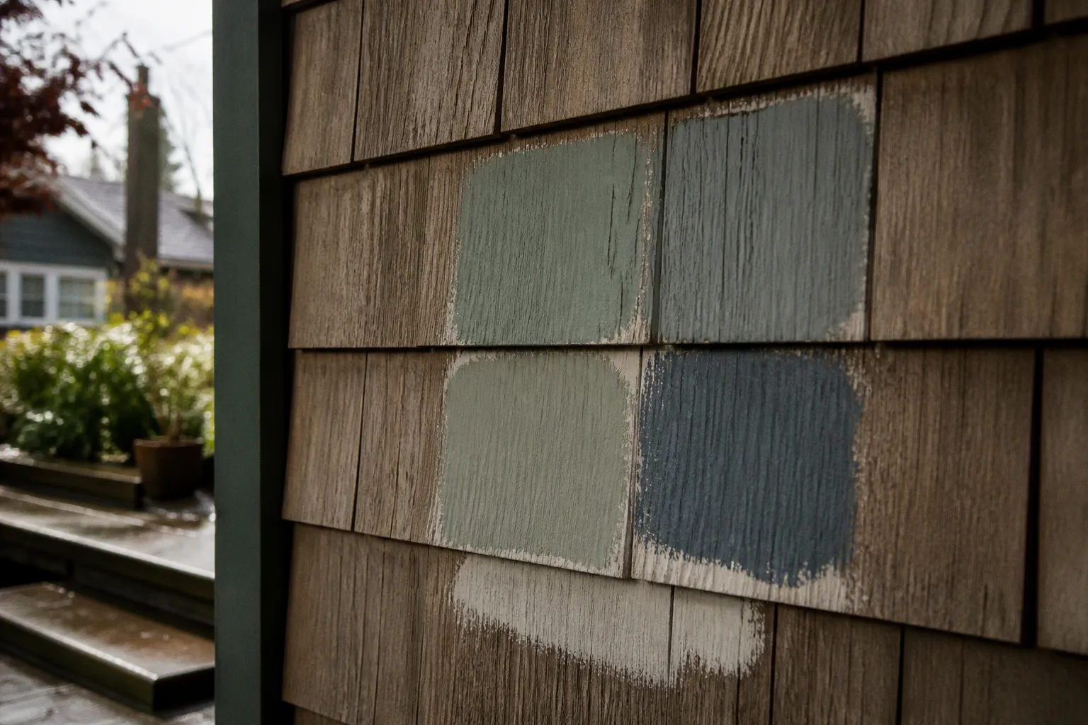
Seattle’s changing light can move a color from warm to cool, from inviting to murky, and from quietly saturated to aggressively bright. Test large samples on the actual house. Small cards are too easily influenced by the surrounding white margin, store lighting, and your imagination.
Test on more than one elevation
Place sample boards or large painted sections on:
- the front elevation;
- the shaded side of the house;
- a wall beneath the eaves;
- the porch area;
- a section near existing brick, stone, or stained wood.
Do not paint a dozen competing swatches directly beside one another and then judge them as if they were isolated. Colors affect each other. A warm gray next to a cool gray may appear more beige or more blue than it will on the finished house.
Keep the sample boards in place through different conditions. Check them in morning light, afternoon light, deep shade, and after rain if the schedule allows. Look from the sidewalk and from across the street. The color must work at the distance where buyers, neighbors, and appraisers actually see it.
Pay attention to undertones
The word “gray” tells you almost nothing. A gray can lean blue, green, violet, taupe, or brown. The same is true of white, beige, and black.
For Seattle Craftsman paint colors, undertone mistakes tend to show up in three ways:
- Blue-gray becomes cold and institutional under cloudy light.
- Yellowed cream becomes dirty-looking beside cool white windows or concrete.
- Green-gray becomes muddy when surrounded by dark evergreen landscaping.
The answer is not to avoid those families. The answer is to compare them against the fixed elements that will remain: roof, masonry, windows, walkway, and landscaping.
Use light reflectance as a practical tool
You do not need a laboratory to understand light reflectance value. The basic idea is enough: lighter colors reflect more light, darker colors absorb more. On a shaded Seattle exterior, a mid-tone can appear deeper than expected. On a sunny south-facing wall, the same color may look significantly brighter.
This is why the same body color can work beautifully on one side of a property and feel too dark on another. The full scheme must be judged as a group, not as isolated swatches.
If a home has limited daylight inside, exterior colors can also affect the perceived brightness around windows and porches. A lighter trim and more reflective entry area may improve the visual welcome without forcing the entire house into a pale palette.
Building a Scheme That Helps the Property Sell
Exterior paint is not only a design choice. It is a transaction decision.
A seller should ask whether the scheme improves the first ten seconds of a buyer’s experience. A buyer should ask whether the color refresh is covering maintenance debt. Both sides need to look past the mood board.
For listing preparation, prioritize changes in this order:
1. Repair water damage, rot, failed trim, and obvious surface failure.
2. Clean the siding, roof edges, walkways, and porch.
3. Improve the entry with a coherent door, lighting, hardware, and planting approach.
4. Choose a restrained body-and-trim scheme that photographs well without looking generic.
5. Add one controlled accent rather than a collection of competing details.
Curb appeal improvement in Seattle is usually won at the threshold. The walk to the front door should feel clear, maintained, and deliberate. Overgrown shrubs can hide fresh paint. Dark paths can make a bright facade feel disconnected. A neglected porch floor can undermine the entire renovation.
Keep landscaping in the color conversation. Evergreen foliage intensifies greens and deepens dark colors. Spring flowering plants can make a neutral facade feel warmer. Wet pavement and black mulch increase contrast. The house does not exist on a blank white background, regardless of what the paint store display suggests.
For buyers considering a remodel, do not assume the existing exterior colors are the main problem. Sometimes the real issue is poor trim placement, a cluttered porch, mismatched replacement materials, or landscaping that blocks the architecture. Paint is powerful, but it is not a substitute for correcting the visual structure of the property.
A paint color cannot rescue a house whose details are hidden, its drainage is failing, and its entry looks forgotten. Fix the hierarchy before you decorate it.
Three Seattle Craftsman Schemes to Start Testing
These are starting frameworks, not rigid prescriptions. Test the families against the property’s roof, masonry, windows, and vegetation.
Scheme one: Moss, cream, and deep red-brown
- Body: muted moss or gray-green
- Trim: warm cream or soft putty
- Foundation: deeper olive-gray or brown-gray
- Door: deep red-brown, restrained oxblood, or espresso
- Best fit: wooded lots, mature landscaping, original wood details
This scheme feels rooted without becoming rustic theater. The warm trim keeps the green from going flat under overcast conditions. The door adds warmth where the entry needs it.
Scheme two: Warm gray, taupe, and blue-green
- Body: medium warm gray with a subtle brown undertone
- Trim: light taupe or softened off-white
- Foundation: charcoal-brown or dark gray
- Door: deep teal or blue-green
- Best fit: urban lots, mixed-material facades, homes with brick or concrete details
This is a flexible direction for Seattle neighborhoods where the house needs to look updated but not stripped of character. It also handles replacement windows more gracefully than a high-contrast historic white scheme.
Scheme three: Soft clay, dark trim, and natural wood
- Body: muted clay, dusty terracotta, or warm brown-gray
- Trim: darker cream, bronze-gray, or deep olive
- Foundation: grounded brown or charcoal
- Door: near-black, dark green, or natural stained wood
- Best fit: homes with warm brick, cedar, copper-toned fixtures, or strong sun exposure
This approach needs discipline. Warm colors can become too orange or too saturated quickly. Keep the trim controlled and let the natural materials provide additional variation.
The Negotiation Rule You Should Follow
Do not choose Seattle Craftsman exterior paint colors by asking which sample looks most attractive in isolation. Choose the scheme that makes the architecture easier to read, the maintenance condition easier to trust, and the entry easier to find.
If the house is historically significant, check local requirements before committing to a scheme. If the property is in a neighborhood with design review or an applicable historic overlay, the paint decision may involve more than personal taste. That is not a reason to freeze. It is a reason to confirm the rules before labor and materials are ordered.
If you are selling, repair first and decorate second. If you are buying, inspect the substrate before congratulating yourself on the new color palette. If you are negotiating, treat fresh paint as evidence of nothing beyond fresh paint until the wood, drainage, caulking, and trim have been examined.
The hard rule: use the body color to support the house, the trim to reveal it, and the accent color to direct the eye. Never let a paint trend outrank the building.